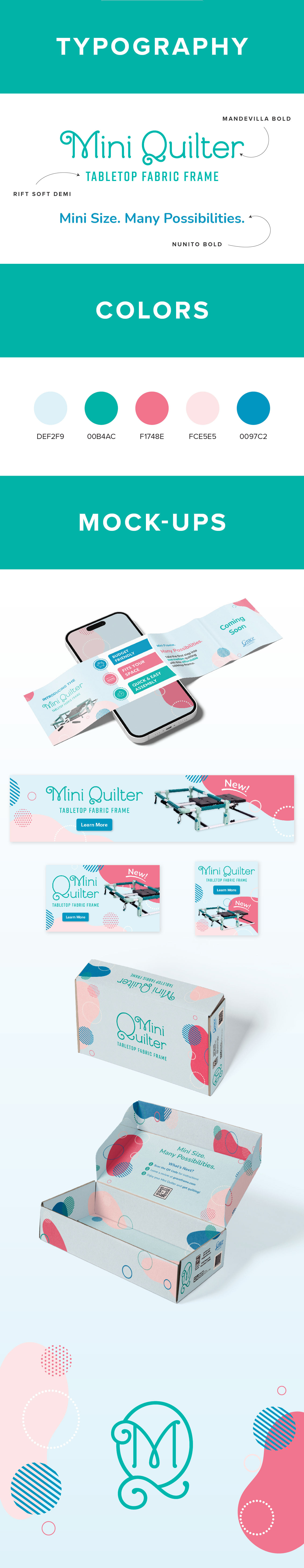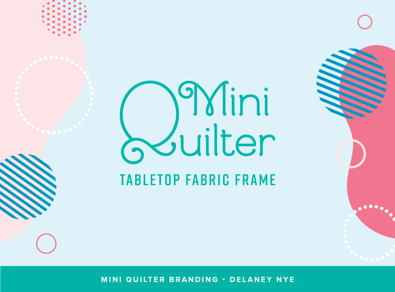
The Mini Quilter is a tabletop quilting frame by Grace Company that makes quilting accessible to a wider audience. For this product's branding, my goal was to convey the beginner-friendly and enjoyable nature of this product.
For the logo, I ended up going with a more delicate, cutesy font that represents the "mini" size of the frame. I paired this with friendly, sans-serif fonts with soft edges. I chose a welcoming, peaceful color scheme of blues and pinks, using a bold turquiose to make the most important elements stand out. To complement the rounded fonts, I used organic shapes and curves as design elements, plus patterned circles to add a bit of flair. The result is a visual brand identity that is inviting and pleasant to people who may have been intimidated by frame quilting before.

A look into my design process for this project.